Welcome To The Dark Side!

This is my middle living room.
For many years this room was purple, teal and mostly cream as it is a very dark room anyway.
A couple of years ago I was sitting here and suddenly thought I should embrace the darkness and go darker to create a little cocoon. Lovely and cosy in the Winter.
At the time there wasn't any black interior paint around apart from gloss or chalkboard paint. I rummaged around in the garage and found some matt black masonry paint which I slapped on the walls. Its coverage is brilliant and only two coats required over the cream coloured walls. Hardwearing and wipeable.
There was one wall around the window which was still cream but I didn't want to paint it black. I chose Crown paint called Addiction, which it certainly is. It's such a gorgeous and sumptuous shade of purple/aubergine, so gorgeous in fact I could lick the walls!

On the chimney breast I put up a floral mural. To have a bespoke one printed in the UK is an absolute fortune, so I opted to purchase from a random company in China. Beware everybody! The quality of the printing is not clear or sharp and quite blurry.
It looks like some amateur photographer has taken a photograph of some fake flowers and a lot of the leaves have the backs facing outwards so you are looking at the back of the leaf.
It is printed on some very heavy vinyl with a similar texture to hessian and was murder to get it to stick to the wall. I even used super glue in some parts banging it down with my fist and swearing like a trooper, it did the trick!
The other problem I encountered were the edges had a white border which should have been trimmed off with a laser cutter. This meant I had to overlap the wallpaper by about 1 and a half inches, a pet hate of mine. This still left a faint white visible line on the edge so I coloured this in with a black felt tip. Because the paper is so thick I can see where it overlaps.
To top it all off I ended up with one extra piece of paper which doesn't match anything. I also had to pay customs duty.
Please think carefully before ordering goods from abroad unless they are from a reputable company and are easily returnable. Anyway enough of that rant.
I had a good old Billy bookcase from IKEA which I think most households have had at some time. This was stuck in my son's bedroom for many years. There is a funny little alcove next to the chimney breast which needed something in it with height.


The foliage canvas is an old canvas which has been lugged round each time we have moved house and has been painted on many times. This time I painted it white, bought some foliage tiles from IKEA and glued them on using a glue gun.
I added a few purple flowers to lift it.
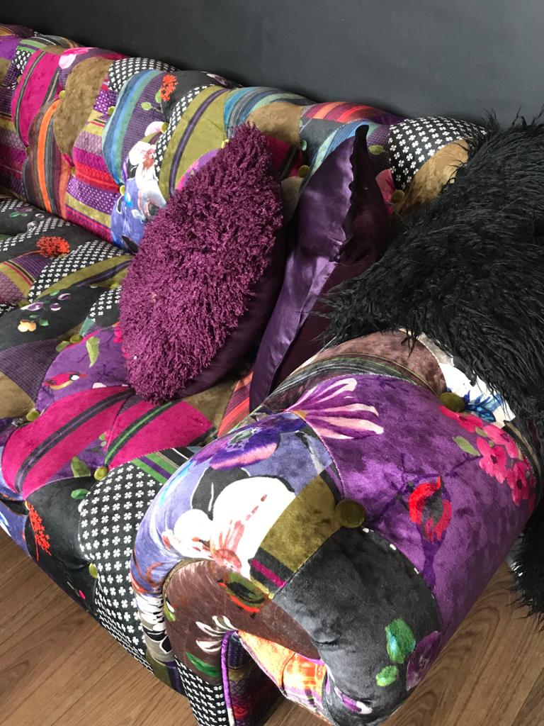
The sofa is a glamourous velvet patchwork four seater chesterfield which I bought off Facebook Marketplace for £250, I do love a good bargain.
I'm obsessed with Marketplace, it's so addictive, I'm constantly scrolling through it, dangerous stuff!


I've hung two large original canvases on the wall. One is an acrylic painting bought from a local market, just what I was looking for to create a bit of drama.
Next to it is my interpretation of The Crying Boy by Giovaani Brigolin. I wanted to add a little bit of humour to it so I painted 'Soft Lad' on his face (a slang expression from Liverpool meaning idiot or stupid) and him blowing a bubble.
Tied it all together by sticking some foliage in the corner.

I placed a black cuddle chair underneath the pictures. This is from Wayfair and made from fake nubuck leather.


To add to the goth look I wanted a standard lamp. A friend gave me the stand which she had already painted. I wanted to top it off with a Victorian lampshade. These sell for around £250! I picked up a ruched cream silk lampshade from a charity shop which I painted black using masonry paint.
It has left the fabric hard and crispy. Obviously it doesn't let any light through it but this adds to the cosy drama. I purchased some gold fringing from Ebay for around £5 and glued this around the bottom.


The coffee table was an absolute bargain for £20 complete. The lady I bought it from had already upcycled it and it was what I had in mind anyway.


The piece of furniture in the bay window is actually an old dressing table with the mirror removed. I've always loved the curvy shape of this but never known where to put it, so consequently it's been shifted from room to room over the years.
I painted this with the same emulsion I mixed for the bookcase but I left the drawers the original burr wood veneer.
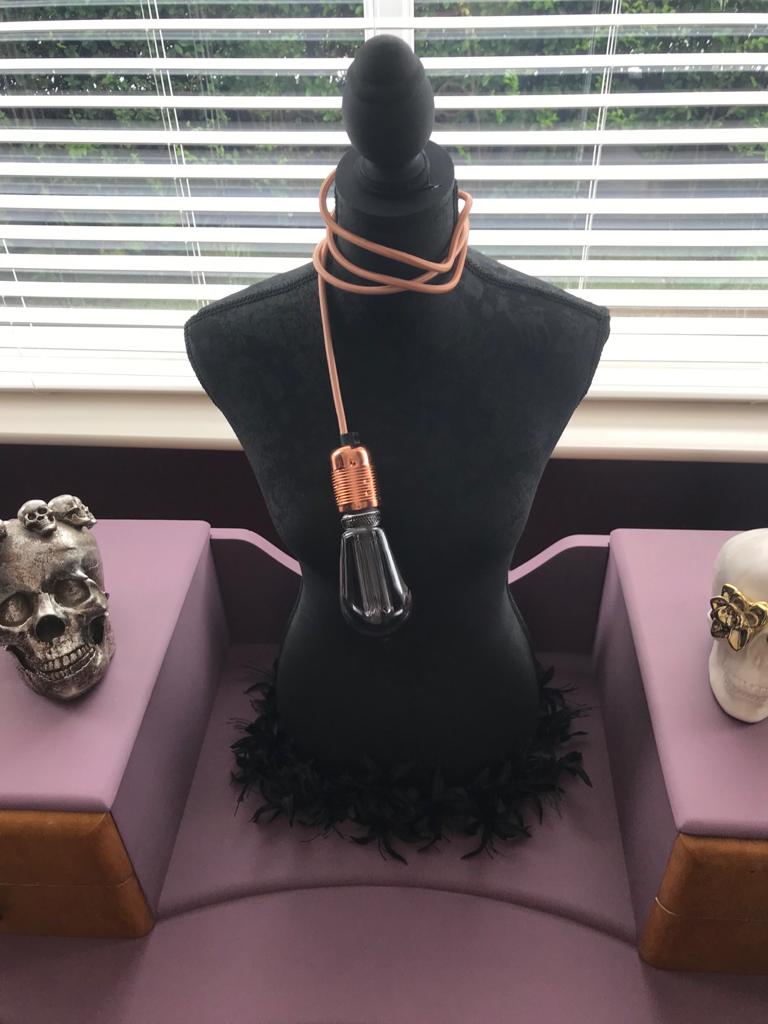
The mannequin was left over from when I had a vintage clothing market stall. It was covered in beige fabric, so I removed the legs and painted it using the black masonry paint.

The Singer sewing machine table belonged to my Nan, it was her first sewing machine which was bought for her 21st birthday.
I removed the machine and put a piece of dark wood on top to create a TV table.
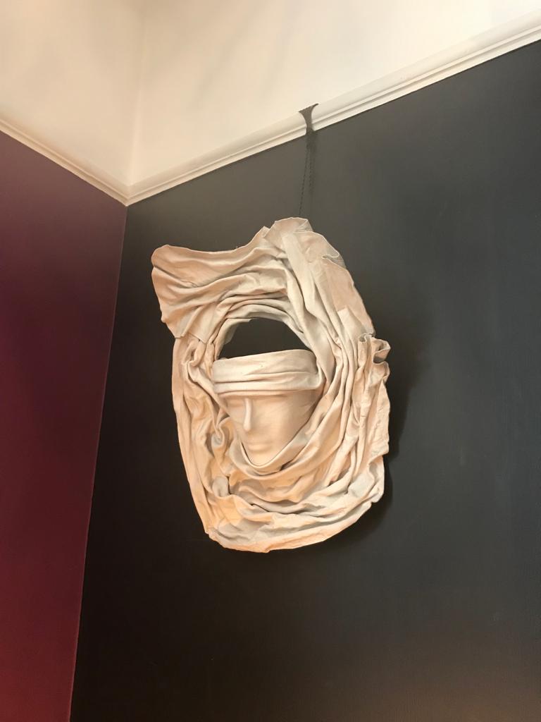
Hanging above this is one half of a pair of wall lights. They are moulded using wet chamois leather and look quite creepy. I've never used them as a wall light so I have just hung one from the picture rail, the black being a perfect backdrop.
The rug is from Aldi for a massive sum of £15. Not the best quality but it looks good in here and does the trick by breaking up the dark wood floor.
As I've said before, I have never spent a fortune on expensive interior items. With a bit of imagination, enthusiasm and obsession a lot can be achieved on a budget, even down to paint.
I tend to try and mix colours myself using remnants of old paint that have been left over from previous jobs. This is not always successful as the colour I want does not always turn out what I had in mind. I sometimes use paint that isn't manufactured for that particular purpose. I've found using a lot of common sense this doesn't always apply ie., matt emulsion used in a high traffic area or well used piece of furniture unless sealed with wax, varnish etc., Unsealed paint on furniture using emulsion is okay depending on where it is used e.g. tucked away in a corner used as a decorative piece.

However, I have discovered certain paints that I've tried to use myself just haven't worked. Ordinary matt emulsion in a bathroom where there is lots of moisture. I painted a feature wall in red using ordinary paint.
The rest of the walls were painted cream in a paint specifically made for bathrooms. The red wall ended up covered in black mould while the cream walls are perfectly okay. I guess I could have sealed the red wall but then I wouldn't have had the excuse to redecorate!
The weirdest thing I ever discovered using paint was mixing together an oil based paint with a water based one knowing full well it would split......it didn't! That was a real mystery.
Anyway, enough rabbiting on. Hope you enjoyed reading and looking at pictures of my 'Goth' living room.
Now enjoy the video!


Comments
Post a Comment